
How Important They Truly Are
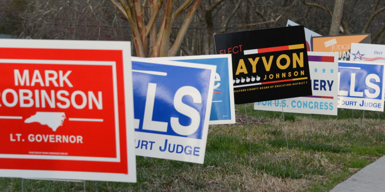
If you’re a political candidate trying to win an election, you really need to be aware of the design and color of your cheap political yard signs. Going wrong with design and color can cost you an election. Using bright, rich-colored lettering against a white background draws the eye. It’s a clean, crisp look that really stands out. It will give you instant name recognition. Light colors look washed out and are difficult to see, even up close. Imagine driving by that kind of look at 50 miles per hour. That cheap election sign is now wasted. If you absolutely feel like you want to go with a lighter color, combine it with a darker color ink. Yellow ink pops nicely when in combination with navy blue, for example.
K.I.S.S.
Back in 1960, the US Navy came up with a design principle acronym known as K.I.S.S., which stands for “Keep It Simple, Stupid.” In essence, most things work best when kept simple and not overly complicated. That holds true for your cheap political yard sign. Keeping your letter color one of a number of standard colors will keep your cost down. The same is true regarding the money you’ll plunk down when it comes to a simple design. Big, bold lettering and a brief message are important for design. A long slogan or complex design will have people driving by trying to read a sign that’s now—unreadable.

Be Consistent
Brand consistency is important for not only businesses, but political candidates as well. Utilizing the same color and design with your marketing helps voters remember you much better. It keeps getting you that name recognition. Consistency is key to your campaign brand and message. You can buy campaign signs cheap, but be cognizant of the importance regarding color and design.