You want to buy some yard signs to promote your business, political advertising, and more. You’ve come to the conclusion that the inexpensive purchase will be worth its weight in gold. You might have already come up with a catchy slogan or the best thing to say for increasing brand awareness and revenue. Now you’ve come to a point in the process where you’re worried you don’t know how to best come up with a design plan. Don’t worry. We’ve got you.
How Design Delivers Your Message:
There are a few factors that go into sign design, and the right choice is something we’ve mastered with sign printing since we opened our shop over a decade ago. Let’s begin with two different types of printing and how they will assist your design decision right out of the gate. We print yard signs digitally or via screen printing. If you’re looking for a smaller number of signs, we recommend choosing digital. With screen printing, the process is cost-prohibitive on small runs. More on that in just a sec. For quick, short orders with more colors in the design, digital printing goes very fast. Dpi (dots per inch) is how resolution in images is calculated in the digital world of custom sign printing. Digital turns out around 600 dpi. What it means—there are 600 dots of color in every single inch of sign printing.
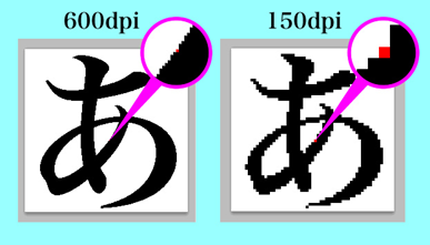
Screen printing would equate to 150 dpi. The size of what are known as halftone dots is the limiting factor via the screen technique. Halftones are a bit bigger with screen printing versus almost imperceptible digital print halftones because the dots are smaller and closer together.
For Good Guys Signs to print a single custom sign via screen printing, the mesh screen required alone costs us $15. That doesn’t include labor, corrugated plastic material, ink, or shipping. What that equates to for you as the consumer is a price tag of around $50 for one sign, depending upon the number of colors you desire on the image you order. The bottom line when it comes to championing the digital world is that you get a single sign with a photo-realistic image that goes for pennies on the dollar compared to a screen print.
The other side of the coin is that with the screen technique, it’s great for bulk orders. Once the screen is prepared, we can simply crank out as many as needed without having to do any changes to the screen or ink. The same amount of setup is required for one sign as it is for 1,000 of them.
So, the process becomes fundamentally like an assembly line. And once that process begins, this method of printing actually becomes way more efficient than with digital. Add to that, with a larger number of signs ordered, the price to you goes down per unit.
Imagery and Text with Design:
This goes hand-in-hand with the two printing methods we’ve been discussing. Let’s say you own a local landscaping company and you want to canvas your town by distributing 500 small signs on half-stakes. You’re likely going to keep it simple. A white sign with green text, just the name of your company and contact information. There’s not much complexity to your signs at all. And imagery is non-existent.
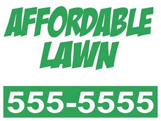
You don’t require the high-end digital dpi to get your message out there. Screen printing is your go-to for this job. You’re efforting to simply get people to pick up their phones and hire you.
Maybe you’re a realtor and you’re designing 10 signs for houses you have on the market. You’ll be wanting bold, bright text and multiple rich colors in your images. Digital is the choice to make in this scenario, because your desire is to make a splash, to say, “World, look at me!” The quantity of your order is low and the quality of its look commands a photo-realistic slickness.
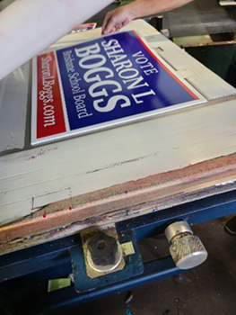
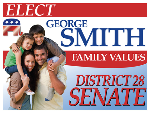
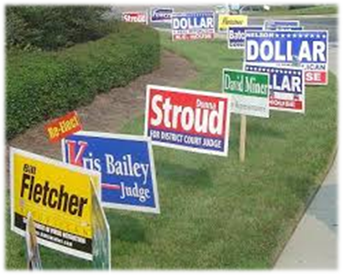
This way of thinking can go for political candidates as well. The guy below seeking office decided to go with a low number of signs, but really wanted to do them up right to differentiate himself from his opponents who went with a basic sign.
Him
Them
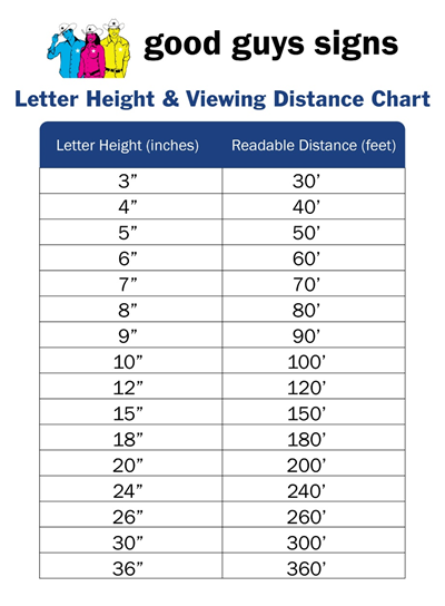
Let’s get into a little math regarding text on customized yard signs. Note that the following equations apply to custom banners. With that, understand how much bigger those generally are than yard signs, and think about how the scale would work, or not work, with your yard sign.
There is an industry-standard formula with banners and letter height known as the 1” to 10’ rule. For every increase of one inch in size of text, it can be seen an extra 10 feet away.
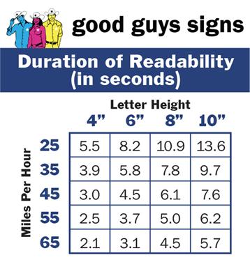
This next chart will let you know the information you need about the amount of time drivers will actually be able to read your sign, given the speed at which they’re driving and letter height. Using the top row as your guide, if someone is driving at a rate of 25MPH and the text height is four inches, they get a glimpse for 5.5 seconds. If your text height is six inches, they can take in that visual for 8.2 seconds, and so on.
The point is that the theory of “less is more” holds true when it comes to your sign design. If you even think you’ve put too much messaging on there, you more than likely have.
Color Background and Combinations:
With design option plans for your custom sign, certain color combinations work so much more readily than others. The layout of text and artwork in relation to the background is also of far greater importance than you may think. Here are a few of the top 15 combinations that will catch and hold the eye of viewers who will see your sign. The information was derived by analysis on readability at a distance by the Outdoor Advertising Association of America.
Yellow on Red: Think of a Big Mac and the fast-food chain worth $170 billion that bangs out those burgers every day. This food chain serves combo dinners to people in over 100 countries across the globe.
Are you starting to think that a nice custom sign with yellow text on a red background might subliminally engage consumers to buy your product?
Red on White: The familiar Nintendo game logo is known worldwide. The company’s most popular item has been purchased by nearly 155 million people. You don’t have to be a gamer, but understand the value of red text on a white background. It could be a game-changer for your yard sign success.
White on Blue: Founded in 2006, Twitter is an online social networking and microblogging service that allows users to post text-based status updates and messages of up to 280 characters in length. These messages are known as tweets.
As of the fourth quarter of 2019, Twitter had 152 million monetizable daily active users worldwide. #greatcombo
You can clearly see that some of the most successful companies on the planet have gone with a very simple, extremely recognizable color combination scheme.
As for yard sign design and background, the same idea applies. The colors on a sign can make or break your impression count. Using bright, richly colored lettering against a white background gets people’s attention. That’s where it starts. If you can’t grab them quickly, you may have already lost. Remember what the famous poet and playwright Oscar Wilde said, “You don’t get a second chance to make a first impression.”
Light colors on a white, or even light background, look washed out and are hard to see, even if the viewer is up close. If a potential customer or voter drives by and they can’t really see your sign, much less read it, your message is now wasted. If you’re totally locked into a lighter color based on brand or a cheery vibe, combine it with a darker color background. For instance, yellow ink pops wonderfully when in combination with black or reflex blue.
We told you at the outset that designing a lawn sign can see a bit overwhelming. But don’t worry. You’ve got this. Because we have you covered. Our goal is to take you on a journey of design that will be stress-free, hassle-free, and even fun. Our supremely skilled sales staff and artisans will deliver you the optimum sign. Stay calm, and let’s do this. Call us today at (800) 614-8040.