Are you gearing up for a political campaign? Perhaps you’re a new business owner seeking to boost brand awareness or planning a birthday celebration with a touch of flair. Whatever your needs, understanding how to design a custom yard sign with eye-catching colors can make all the difference. From drawing attention to delivering a message, the right design ensures your yard sign stands out and gets noticed. Let’s dive into the elements that make your customized sign a true attention grabber.
Yard Sign Harmony:
harmony- [ hahr-muh-nee ]: a consistent, orderly, or pleasing arrangement of parts; congruity.
When you think of harmony, music might be the first thing that comes to mind, but that concept extends to poetry, art, and even color. In the context of your custom yard sign, harmony is critical because of how the human brain processes visual stimuli. A harmonious design creates a sense of balance and cohesion, ensuring your message resonates with viewers. Without it, your sign could feel disjointed or overwhelming, leading to missed opportunities to engage your audience. But why is this so impactful? Let’s explore how harmonious design directly influences the effectiveness of your sign.
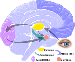
You might consider starting with a simple, subdued color palette for your sign to keep it approachable. However, there’s a fine line to walk. At one extreme, using a bland design could underwhelm viewers, leaving your message overlooked or ignored. The human brain naturally disengages from understimulating visual experiences. Conversely, an over-the-top design packed with every color imaginable risks overwhelming the audience. Too much chaos can create confusion, causing the brain to reject what it can’t organize or comprehend.
The key is balance—finding that middle ground where your design is both engaging and digestible. Think of this equilibrium as the calm center that connects opposites, creating harmony and visual appeal. A well-created color palette can spark interest and instill order, making your message memorable and effective.
How Colors Draw Attention and Hold It:
Nearly every color can grab attention, but the way it does so varies. Take red, for instance—used in STOP signs and warning signals. It’s impossible to ignore. Its bold and vibrant nature draws the eye, often triggering a psychological association with urgency or danger. This makes red an effective choice when the goal is to prompt immediate action or focus, ensuring the message is seen and understood.
Black: A color that embodies duality, black conveys both authority and sophistication while also hinting at mystery or menace. It’s a strong, impactful choice for yard signs seeking to exude power or seriousness.
Blue: Known for its calming qualities, blue fosters a sense of trust, reliability, and stability. Whether you’re promoting a political campaign or a business, blue signals cool-headedness and reassurance to potential voters or customers.
Purple: This regal hue is not just for royalty—it symbolizes creativity, spirituality, and ambition. Men shouldn’t shy away from using purple; its depth and richness can make your sign stand out with elegance and purpose.
Orange: The color of energy and enthusiasm, orange exudes a sense of action and excitement. Perfect for campaigns or promotions, it tells your audience you’re dynamic, approachable, and ready to engage.
Those are just a few examples of ways that hues can draw a prospect’s attention, hold it, and have you getting the results you’re looking for.
Custom Yard Sign Color Combinations:
Got a quick second? Let’s test your attention span. What’s the background color of a standard STOP sign?
Now, this about this: what colors make up the body of a typical Word document? Or the uniforms of your favorite sports team? Chances are, you didn’t need much time to bring those images to mind.
Why does this matter for your yard signs? Because color combinations play a huge role in creating a visual memory. Signs with effective, recognizable palettes stick with people, just like those other visuals you recalled so easily. Whether you’re selling products, announcing an event, or making a statement, the right colors could be the key to grabbing—and keeping—attention.
There are some really top-tier combos that can gain you success with your real estate sign, your birthday sign, or even just yard sale signs. We’ll run through just a few.
Red on Yellow: Does this image seem a little familiar?
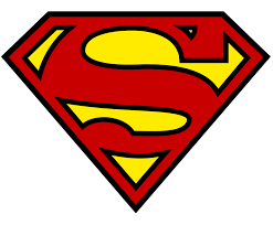
If Superman can save the planet, maybe with this color scheme, you will at least boost sales without having to wear a cape.
Red on White: You don’t have to sit in the basement and play video games until 4am to recognize the logo here.
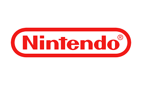
You don’t have to be a gamer to understand red text on a white background could be a game-changer for you.
Lastly, White on Green w/a touch of Black:
In the time you could’ve spent sipping on one of their lattes, you could’ve spoken to our talented salespeople to get you the customized yard sign you need.
Yard Signs and the Color Wheel:
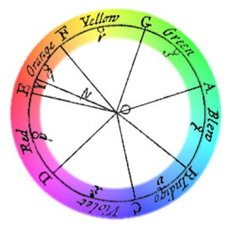
In 1666, Isaac Newton didn’t just theorize about gravity—he also laid the groundwork for understanding color relationships by creating the color wheel. His experiments with light and prisms demonstrated how colors emerge from refracted light, and the wheel visually connected these hues.
Over the centuries, artists and designers have refined Newton’s original concept, using it as a tool for creating harmony and contract in the visual design. Some foundational themes that emerged include:
Complementary Colors: Opposites on the wheel, like blue and orange, create vibrant, high-contrast colors.
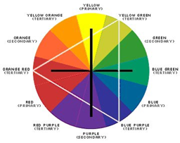
Monochromatic Colors: a few shades, tones, and tints of one base color that deliver a subtle, non-contrasting, harmonious combination
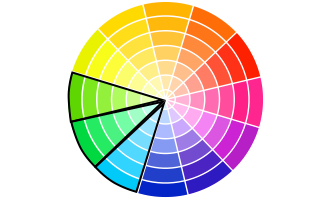
Analogous Colors: three colors that reside next to each other on the color wheel. In this scenario, it’s best to select one dominant color and use the others as accents
Isaac Newton didn’t earn his place as one of history’s most renowned scientists by chance. His exploration of light and color paved the way for concepts like chroma harmony, which still hold significance today. This understanding directly applies to your custom corrugated plastic yard sign, where color plays a critical role in delivering a clear, memorable message that resonates with your audience. By using balanced, eye-catching color combinations rooted in Newton’s principles, you can ensure your sign captures attention and communicates effectively.
We’re here to meet all your needs, whether it’s discussing design, offering advice, or ensuring your order arrives exactly as you envision it. With over a decade of experience, we’ve mastered the art of printing yard signs. Our skilled and dedicated team takes pride in delivering high-quality results tailored to your vision and often exceeding expectations. Simply put, we’re among the best in the business, ready to bring your ideas to life.