
Quick…what colors are on a standard STOP sign? What colors are in the body of a typical word doc? Your favorite sports team’s uniforms? It likely didn’t take you more than a couple seconds to form those combinations of hues in your mind. If you’re going to put up a yard sign or hang a banner to sell goods or promote an important event, take note of those images that came to you so easily. Color combinations in signage and messaging mean as much as any other part of what your intent with a yard sign or banner might be.
We have unearthed 15 color combinations of lettering and background that have been tested for effectiveness. The analysis on readability at a distance was conducted and results delivered by the Outdoor Advertising Association of America (OAAA). Time to run through the top 15, counting down from 15 to 1 (kind of like a top 40 on pop radio). We’ll provide some quick notes as to why you should strongly consider having these combined colors on your messaging.
#15. White on Red: Remember the stop sign? Enough said.
#14. Red on Yellow: Does this image seem a little familiar?
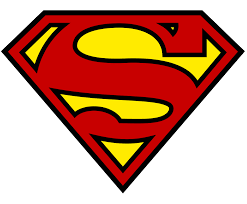
If Superman can save the planet, maybe with this color scheme, you will at least boost sales without having to wear a cape.
#13. Yellow on Red: Think of a Big Mac and the fast food chain worth $170 billion that bangs out those burgers every day. Serving combo dinners to people in over 100 countries across the globe…what would be their value if they picked the number one color combo? Are you starting to think that a nice custom banner with yellow text on a red background might subliminally engage consumers to buy your product?
#12. Red on White: You don’t have to sit in the basement and play video games until 4am to recognize the logo here.
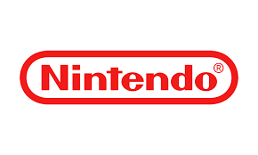
The familiar Nintendo game logo is known worldwide. The company’s most popular item has been purchased by upwards of 155 million people. You don’t have to be a gamer, but understand the value of red text on a white background. It could be a game-changer for your yard sign or custom banner.
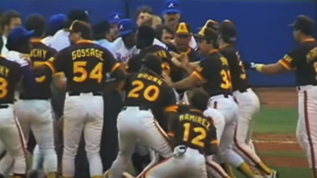
#11. Yellow on Brown: Here are the San Diego Padres in the middle of a brawl with the Atlanta Braves, circa 1984. Fighting for 1st place, these guys, with their yellow letters on brown-colored jerseys, ended up in the World Series that season.
Doesn’t quite do it for you? That’s OK. No doubt you’ve heard that rumbling of a large van about to deliver a package to your home or office door. Ring a bell?
UPS has a global delivery volume of 22 million packages and documents every single day. What can brown do for you? Try it on your banner or custom yard sign, and see what happens.
That’s the first five, counting down to the number one readable color combination. We take a quick break to talk about background colors of your yard sign or banner. There’s a bit of psychology that illustrates what certain colors mean. For example, if you are a political candidate, and you’re ordering campaign yard signs, blue, as well as purple are strong choices. When things aren’t going so well in the world, people like to see that their leader has a cool and collected persona, that things will be okay. The blue hue is associated with calmness. It gives people a sense that the person they elect won’t freak out at the first sign of trouble.
For you male candidates, don’t think of purple as an effeminate color for a sign. This color speaks of royalty and spirituality. If you hadn’t thought of that before, maybe you should think about it now. Depending on the shade of purple, it can be highly effective on that corrugated plastic. Click here for more on valuable background colors for your yard sign or banner
Let’s get back to the countdown.
#10. Brown on White: If you want to stand out against the competition, try going with brown. It is very underused, and can give off a cool aura so you can run with this to differentiate yourself. The color brown also evokes images of the earth in people’s minds, so you can score some points there, as well. And it is widely known in our industry that white is an absolute can’t-miss color combinations. Four combinations out of the 15 on the list in this article have white for a background.
#9. Brown on Yellow:
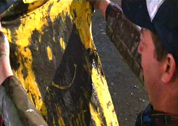
This is a classic scene from the award-winning movie Forrest Gump. Gump was running across the country, and a passing truck splashed mud all over his face. The actor here, who plays Harvey Ball, gave Forrest this blank yellow shirt to wipe his face off, and history was made. Ball is the inventor of the classic smiley-face t-shirt that dates all the way back to 1963. It’s obviously still going strong today. What’s additionally cool about this is that it’s the exact opposite of color combination #11. So it’s worth thinking about this design to differentiate your brand from competitors on custom banners or lawn signs.
#8. White on Brown: While not often used by mega-companies, white on brown is an excellent choice for your banner or sign. White is associated with innocence and purity from a psychological perspective. It is also the most commonly used text color on campaign lawn signs. And we already went over the correlation brown has with the earth. Nicely seen from a distance, and the fact that there aren’t a ton of “big boys” out there making this combo their go-to, this could be your go-to.
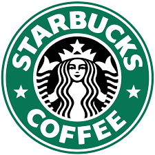
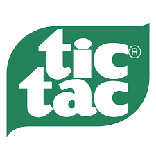
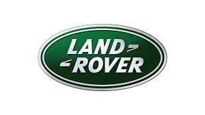
#7. White on Green: Pretty recognizable, wouldn’t you say? Here’s a plan—go get a Starbucks coffee, have a couple tic tacs to freshen your breath, jump in your Land Rover to drive home and call us to hook you up with a color scheme that is quite obviously effective as can be.
#6. Blue on Yellow:
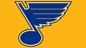
The first image is the logo for the St. Louis Blues hockey team. They have made the playoffs in 43 of their 52 years of existence, reaching the Stanley Cup Finals four times. That’s success. That’s a brand. That’s a color scheme to strongly consider for your yard sign or banner. The second logo speaks for itself.
We’re down to the top 5. Which unification of pigments will be the top dog? One more timeout before we wrap it up with the crème de la crème.
Color sign and design play an essential role in the success of signage. Using bright, rich-colored lettering against a white background draws the eye. It’s a clean, crisp look that really stands out. Light colors tend to look washed out and are difficult to see, even up close. Imagine driving by that kind of look at 50 miles per hour. See more on sign design and color.
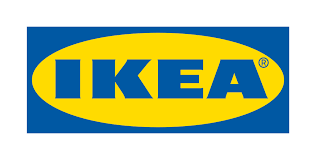
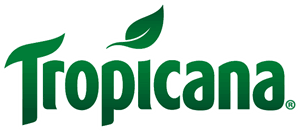
#5. Green on White: This combo for any size or special shape-cut yard sign or custom banner should be music to your ears. Get It?

Thirsty for more knowledge on how chroma classics can aid in the promotion of your event, your sale, your grand opening, your political campaign? Gulp, gulp, aaahhhhhhhh! Refreshed? Then let’s move on!
#4. White on Blue: Here’s what we DON’T recommend. We strongly advise that you don’t tweet while driving your Ford. What we DO recommend is that you run with this pairing of colors on your banner or sign. #greatcombo
#3. Yellow on Black: If you want consumers or potential clients to think of you as bright and cheery, slap yellow on as lettering of your sign. It’s a great hue for that, and it reflects the most visible light, making it very readable. And as far as black for the background, color, it provides viewers a sense that you’re authoritative and powerful. It’s a fantastic background color on a sign.
The mixture of yellow and black appeals to both sides of the human psyche…you’re a happy sort, whilst being strong at the same time. That is one heck of an emblem to win both sides of human nature over. Yellow letters with a background for custom banners…yes. Black background with yellow text on top of it…double down on this duo.
#2. Black on White: Ever seen this?
Or this?
This stylish enough for you?
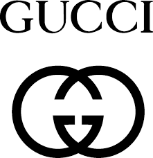
It’s absolutely no surprise that three of the most well-known brands across the globe have acquired such a following and such brand recognition. You might think that brighter colors, and more of them to draw the eye, would be the way to go. However, if you think simpler, you’re thinking smarter. Work with your design team or our design team on how you want to present your logo/brand. Then, avoid the clutter mistake that all-too-many businesses fail to do, and then ultimately…they fail, period.
And now, drumroll please……………………………………………………………………….
#1. Black on Yellow: It has come down to this. The authority logo. The duo of domination. The supreme set. Black on yellow. As you see the images laid out below, a scenario for you similar to earlier in the article.
Want to head the movies with knowledge you need from IMDB, watch Batman
rid Gotham of all villains on the big screen, then trade in the batmobile for a Ferrari…just for a night?

That sounds like a whale of a time! Black on yellow conveys superior confidence. It is number one on the top 15 of the Outdoor Advertising Association of America’s absolute standard for distance readability (link to their article here). When designing your yard sign or custom banner, know that yellow words against a black background is the champion choice.
There you have it. If you’re deciding to go with a color pairing outside of this list, that’s still fine. Your goal is to succeed, at the most optimum level you can, and we can surely help you out in your quest with our design knowledge.