
If you’re a business owner and you’re about to advertise or promote with a yard sign, we will tell you that’s a great way to go. Yard sign advertising is as cost-efficient a method as there is out there. In addition to how inexpensive yard signs are, the Wall Street Journal says that a single one has the potential to be seen by as many as 25,000 per day. We have some important tips to help ensure that you maximize your customer count. In this article, we’ll cover:
- The importance of color contrast
- Why the right font choice is significant
- How images play a huge role for effectiveness
Color Contrast Matters:
We’ve been at this sign thing since 2009, and we fully understand how important it is to have contrast with the colors on your sign. We tell you, for your success, that light-colored text on a white or light background will not drive engagement. The graphics will look washed out and will be severely difficult for potential clients to see, even if they’re up close. And if they can’t read your message, people driving in their cars will undoubtedly be unable to read what your sign says.
As with that example, the same principle applies to dark text on a dark background. Again, indiscernible. There are some fantastic combinations of color contrast that will bring you instant readability and recognition.
There was a study on color contrast and readability of signage done by the Outdoor Advertising Association of America (OAAA). Their analysis and results were provided. To get you en route to sign success, here are the top 5 color combinations. Note the contrast in colors.
#5- Green on White: This combo for any yard sign should be music to your ears. Get It?
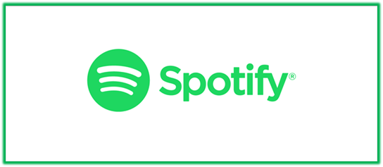
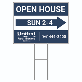
#4- White on blue: 2.6 billion users monthly on a worldwide basis can’t be wrong, right?

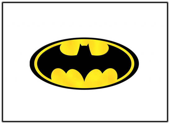
#3- Yellow on Black: This tire company has a few versions of its logo; this is one of them. If you pick this color combination for your yard sign, you may just have a great year in sales.

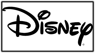
#2- Black on White: If you don’t recognize this logo, you’d be the only person over the age of 2 who doesn’t. It didn’t get the slogan “The happiest place on earth” by accident.
#1- Black on yellow: The third best color combination and contrast was this in reverse. Two of the top three let you know that you simply can’t go wrong with this pairing.
Font Findings:
What have we found out about fonts when it comes to custom yard signs? Plenty. Which of these three is easiest to read?
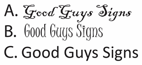
We’ll go ahead and assume you chose C.
That is in Calibri font. It was easiest for you to read. One reason is that most computers default to that type of font, so you are extremely familiar with it.
There will be exceptions, but ordinarily, it’s a good idea to use fonts that are recognizable. This will make attracting potential customers easier for you. Among the familiar fonts are Arial, Helvetica, and Times New Roman. They’re all recognizable, distinguishing fonts you should consider using. They’re fonts we are used to seeing on our cell phones and in emails. So, choosing these types of fonts earns you an instant connection with possible clients.
There are exceptions to the above. An example of that would be if you own a fancy, upscale business. Using cursive or calligraphy-type fonts delivers the message that you are high-end, a cut above your competitors.

Also, be aware and be careful when it comes to mixing in too many fonts on your sign. If you overdo it, your message can become confusing to the eye. The general rule on this is to use one to two different font styles—at the most.
This article should be easy for you to look at and read. We’d have your head spinning if we wrote it with all these different fonts mixed together:
To hammer the point home, font choice is equally important as any other element that goes into creating a successful yard sign design.
Images on Yard Signs:
When it comes to images in a custom yard sign design, strongly consider using them. There are reasons to do it. Studies have shown that people want images.
Did you know that:
- 65% of this country’s population alone say they are visual learners
- 94% of articles with relevant images receive more views than those without
- 10% of information is recalled three days after hearing it. When a picture is brought into the fold, that number ramps up to 65%
You’re not old enough to remember the first-ever televised presidential debate. It took place on September 26, 1960, with the combatants being a seasoned politician in Richard Nixon and a young John F. Kennedy. Something strange yet interesting transpired during the debate. Nixon had a propensity to sweat more than most. As the debate moved on under the hot studio lights, the good-looking youngster in Kennedy appeared to be more composed than the sweaty Nixon.
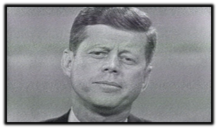
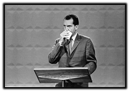
People who watched on TV saw a suave Kennedy and his impeccable hair and said he won the debate. It paved the way to his election that November. Oddly enough, those listening to the debate on the radio actually believed it was Nixon who was better. What’s the point of this history lesson? Visual displays convey more than written or verbal cues alone. That is the power of the picture. The power to influence people.
An image of your face on your yard sign can have a significantly positive impact on your sales. First off, your facial image is an effective tool. It will be imprinted in the minds of those who see your yard sign. You will stand out in a sea of text-only signs.
It’s not widely known, but there is actually an entire area of the human brain dedicated to the task of facial recognition.
People driving by only have a split second to take in your sign. A brief message with your face that brims with warmth yet confidence will undoubtedly leave an impression.
Lastly, regarding images and their role in advertising, know this—the image can be anything. Let’s use a car wash company for this example, though it can work for nearly any business you own. You could buy two custom yard signs. They are of the exact same car. One sign could display an absolutely filthy vehicle. The other is positioned right next to it, but this one is spotless, as if it just went through your car wash. Basically, your signs are a before and after.
When people see that, it could very well trigger them to want a clean car. And guess what? Sales could skyrocket before you know it.
Wrapping up:
We’ve documented three highly important facets regarding advertising and promoting your company on custom yard signs. If you have any more questions, we’re here for you. If you’re set to order a single sign or 500 of them, our slick professional sales team is at your fingertips. Call us at (800) 614-8040 or head to our website at www.goodguyssigns.com. Let’s close out this article with some fun. Scroll down right past this picture.
For a somewhat whimsical, but still very important take on the importance of yard sign design, take a look at this fun, Dr. Seussian-style article, written by the owner of Good Guys signs.