Size DOES Matter
When it comes to making the most out of yard signs, every detail counts. You might think, “It’s just a small 18”x24” piece of plastic. How much could really matter?” Fair question—but whether you’re ordering one or 1,000 yard signs, you’ll want your message to have maximum visibility and impact.
Maximizing the Impact of Your Yard Signs
The size of your text and overall message plays a crucial role in effectiveness, especially for drivers who have mere seconds to take in your sign. Here’s how to ensure your yard sign grabs attention:
- Text Size and Format: Avoid the common misconception that ALL CAPS is always better. Studies show that a mix of upper and lower case letters is more legible from a distance. This is particularly important since most viewers will be driving past your sign.
- Letter Height Rule: Follow the industry-standard 1” to 10’ rule: for every 10 feet of viewing distance, increase your text height by 1 inch. For example, a sign placed 50 feet away from viewers should have letters at least 5 inches tall.
- Keep It Brief: Drivers won’t have time to read a lengthy message. Opt for a concise, clutter-free design. A simple phrase and phone number often work best.
- Pedestrian Areas: If your sign is in a spot where viewers are standing still, such as near a sidewalk, letters can be smaller—around 2 inches tall for visibility from 50 feet.
Investing in corrugated yard signs means paying attention to more than just size—it’s about crafting a clear, readable, and compelling message that resonates with views, whether they’re on foot or behind the wheel.

Key Design Factors for Custom Banners:
Once the political season wraps up, yard signs often take a back seat, and custom banners become the go-to option for businesses and events. If you’re planning to use a banner, the same principles of letter size and distance, as outlined in the yard sign chart, apply here. Here’s how to design a banner that captures attention and communicates effectively.
- Letter Thickness: Choose bold, simple fonts to ensure your message stands out. Thin or decorative fonts can be hard to read, especially from a distance.
- White Space: Follow the 40/60 rule: Use 40% of the banner space for text and visuals, leaving 60% as white space. This contrast improves visibility and makes your message more legible.
- Kerning (Letter Spacing): Kerning, the spacing between letters, works hand-in-hand with white space. Letters spaced too closely can blur together, while excessive spacing can disrupt readability. Aim for balanced spacing to maintain clarity.
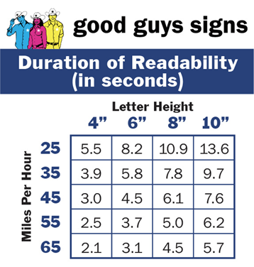
Your banner’s visibility depends on two factors: the speed of passing traffic and the height of your letters. Larger letters allow viewers to read the banner from farther away, giving them more time to absorb your message. Use this chart to calculate read time:
And here’s more to throw at you so that you can determine what your banner letter size should be.
Letter Height Formula:
LH = (LN x 10 + SD) / 5
Formula Key:
LH is letter height in inches
LN is the number of lanes of traffic
SD is the sign distance from curb in feet
Here’s our example:
2-lane road
Sign is 5 feet from the corner
So, the LH is (2 x 10 + 5) / 5
Using that math, the letter height on your banner would be 5 inches tall.
Remember at the beginning of this article when we told you there are many factors that go into the decision-making process of yard signs and banners? We only touched on sign letter height. So, don’t just throw a sign or banner together willy-nilly. Many, many customers will be lost if you don’t plan accordingly. Head to our website or call us at Good Guys Signs for any questions you may have. Our numbers are (800) 215-6424 or (813) 447-4770. Our friendly and knowledgeable staff are ready to help.