You’re going to design a unique image or a cool visual idea for your custom T-shirt. But how do you choose the shirt color and the color of your design so they will live symbiotically, complementing each other the best? There is not a rulebook of requirements about hue decisions. You won’t get arrested and thrown in jail if the color combination isn’t perfect. Notwithstanding, there are several mergers of chroma that work together fantastically.
The Classics:
Black, white, red, blue, and gray T-shirts have a long standing in the world of torso garments. One reason is their versatility with the cornucopia of colors they match well with. Almost any color of the spectrum will find a home on one of these shirt hues, be it an image, letters, or numbers. There are a few supremely excellent combinations within this group of colors, alone.
Some Perfect Combos:
Red & White- The pairing of red and white is so enticing as a duo. Colors for a T-shirt design pop brilliantly, and it works whether your shirt is white and the ink is red, or vice versa. In addition to the sharp, crisp colors that draw the eye, the contrast between red and white is high (we’ll talk contrast later in this article), making the colors stand out even more.
Blue & Gray- Combining blue and gray conveys a feeling of calmness and coolness. Like red and white, this pair of colors is reversible between T-shirt and ink. Also, with so many gradients of both hues, there is a plethora of possibilities to go with.
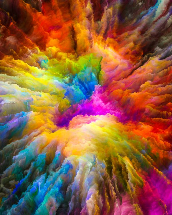
Colors of the Rainbow- Remember ROY G BIV? As children, we relished in seeing a rainbow. We were enthralled with its brilliantly shone colors, and remembering how we learned red, orange, yellow, green, blue, indigo, and violet via that “name” acronym. The colors are bright, they naturally go well together, and they exude joy. So, for an effect of lightness and fun, consider putting these colors together on a light or dark T-shirt.
There are many more combos that go together like peanut butter and jelly, but those are just a few.
Contrast:
This might sound counterintuitive, but contrast between colors is a really good thing. Think about some pretty recognizable logos:
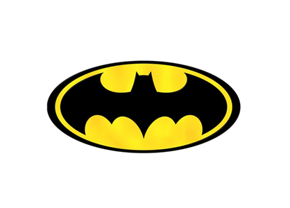
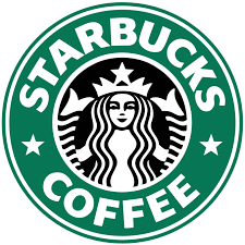
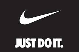
The contrast between the colors in these ultra-successful logos is starkly opposing. And yet, it totally works. Like the red and white contrast discussed earlier, contrast makes each color more distinct, rich, and powerful. Dissimilarity draws the eye, and emphasis can readily be created through contradiction. In essence, if you have a dark shirt, light-colored ink designs will contrast and catch the retina. If you have a light shirt, darker-colored ink images will oppose the light coloring of the garment. Bold juxtaposition is an exceptional way to go when combining hues on a T-shirt. Should you desire to do a light-colored shirt with pastels or light yellows as far as the ink for your design, you can help bring those colors out with an outline or border of darker ink.
Now, do you know what this is?
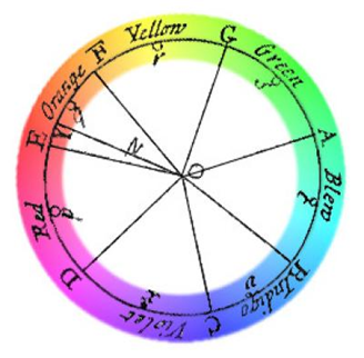
Isaac Newton & the Color Wheel:
This is the color wheel, invented in 1666 by Isaac Newton. He created this to demonstrate the relationship between colors. Taken from his experiments and theories, designers and artists have modernized the color wheel. Among the themes with design are:
- Complementary Colors- colors on the opposite side of the spectrum that complement each other due to contrast
- Monochromatic Colors- three shades, tones, and tints of one base color that deliver a subtle, non-contrasting, harmonious combination
- Analogous Colors- three colors that reside next to each other on the color wheel. In this scenario, it’s best to select one dominant color and use the others as accents
So, it means that while contrasting a custom shirt with custom ink is awesome, there are certainly no laws binding anyone to specific color combinations. Color and design are truly subjective, period.