You may be a politician, a realtor, a business owner, or are just having a garage sale. Regardless of what you do, and what your intent is, you want to draw the eye of potential clients, right? Right. How best to do it with your yard sign is what we’ll discuss here.
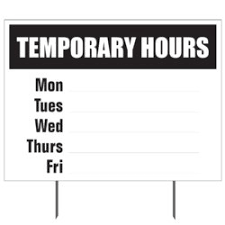
First, and maybe most important…use contrasting colors with text and background. If you use similar colors for both the background and the text, your message will get lost. Guess what just happened? You lost potential sales. Use a very dark color on a light color, or vice versa. See color background planning here. Read more about sign color and design here. To be clear, contrast your colors. For example, think about choosing a simple, black and white sign. Consider putting your business’ name on the top, black on white, with your phone number or website on the bottom, white on black.

This will keep your sign simple and make your contact info easier to recall. If you want to put your logo on the yard sign, smaller and simpler are better. Just give passersby an idea. No need to try and overwhelm them with a logo that isn’t already recognizable.
For your yard sign to be as highly effective as possible, it should say something catchy with as few words as possible. Display words that share the qualities of what you’re trying to convey. Pictures are also a great addition and can say a lot. You’ve heard it many times…a picture is worth a thousand words. Think about utilizing images on your yard sign.
What Colors Attract the Most Attention:
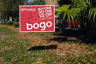
The colors on a sign can make or break your impression count. Using bright, rich-colored lettering against a white background draws the eye. It’s a clean, crisp look that really stands out. It will give you instant recognition. Light colors look washed out and are difficult to see, even up close. Imagine driving by that kind of look at 50 miles per hour. That sign is now wasted. If you absolutely feel like you want to go with a lighter color, combine it with a darker color ink. Yellow ink pops nicely when in combination with navy blue or black, for example.

Most colors work against most contrasting backgrounds, but there are combinations that you really need to examine for the utmost effect in sign readability.
Text Amount on Yard Signs:
Here’s a good place to start. If you even think you have too much text on your yard sign, then you do. It can be hard to pull back on providing as much detail as you can and want, but too much detail takes too long to read. Nike uses only three words for its ultra-successful brand: “Just Do It.” Seems to have worked out pretty well for that company.

Its net worth is nearly $40 billion. To put it bluntly regarding your lawn sign…brevity is better. You also want to make sure at least one third of your sign is blank space. More blank or white space means more legibility. It means people who drive with a lead foot can still take in your message when buzzing by.
Additionally, easy-to-read fonts are important. Arial, Helvetica, and Times New Roman are all good, distinguishing fonts to use. They are fonts people are used to seeing on their cell phones, in emails, and in texts. So, there is a familiarity that instantly connects your signage and viewers’ minds.
Yard Sign Letter Height:
Also known as yard sign letter size, this is an often-overlooked aspect when clients are working through signage creation. We’ve told you to use as few words as possible. Succinct and concise message is the idea. Let that sink in. By using fewer words, you now have the ability to make your yard sign letters bigger. The easy picture in your mind should now be that the bigger the letters, the farther away your message will be readable. This significantly increases the time viewers have to let your messaging manifest in their minds, and can play a powerful role in memory and future purchase by potential customers.


