
You’ve got just seconds. In signage, that’s not a figure of speech; it’s biology. Preattentive vision is the brain’s lightning-fast, 3-5 second scan of a new scene to decide what deserves attention. In that brief window, before conscious thought even starts, your sign either gets noticed or disappears into the background.
Designing with this in mind means working with human nature, not against it. Here’s how to make those seconds count.
Why Design for Preattentive Vision Matters
In the real world, your sign isn’t competing in a vacuum; it’s fighting against:
- Competing storefronts
- Traffic signals and road signs
- Trees, poles, and seasonal decorations
- Phone screens and in-car distractions
If you miss the preattentive window, the viewer’s brain may never register your sign. That can mean:
- Lost foot traffic: Customers simply don’t notice you in time to turn in.
- Weaker wayfinding: People can’t find your location even when they’re looking for it.
- Missed impulse sales: The moment of curiosity or interest never sparks.
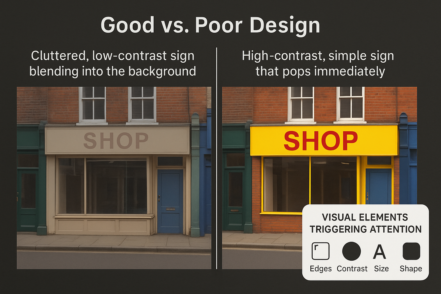
The Four Design Elements That Trigger Attention
- Color & Contrast
Our eyes are drawn to differences. High contrast, like black on yellow, white on red, or dark blue on white, makes a sign stand out instantly.
- Do: Choose colors that separate strongly from both your sign’s background and the environment behind it.
- Don’t: Use muted or low-saturation colors that blend into surrounding walls or landscapes.
- Size & Simplicity
Bigger isn’t always better, but bigger is always easier to see.
- Use large, bold fonts that are legible from your target viewing distance.
- Keep text to 1-2 words on each line for drive-by readability.
- Avoid crowding your design with too many messages or decorative elements.
- Position & Viewing Angle
Even the most eye-catching sign fails if it’s in the wrong place.
- Place your sign where it enters the viewer’s natural line of sight, slightly ahead and centered along their approach.
- Consider approach speed:At 35 mph, you have roughly 200-300 feet of reaction distance. At 55 mph, it’s 325-485 feet.
- Shape & Imagery
The human brain is wired to notice certain shapes, especially faces, symbols, and icons.
- Custom shapes can help break the monotony of rectangular signage.
- Faces or human-like silhouettes create an instant focal point.
- Symbols (a coffee cup for a cafe, a wrench for an auto shop) communicate faster than text.
Environmental Context: The Hidden Factor
Even a great design can fail if the background is working against you.
- Busy visual environments require stronger contrast and simpler layouts.
- Seasonal foliage can cover parts of the sign.
- Sun position and glare can wash out colors at certain times of the day.
Tip: Take test photos from the actual viewing distance before finalizing your design. See how your sign competes in the real environment.
Testing Before You Commit
3M Visual Attention Software (VAS)
This tool predicts which parts of a scene will be noticed in the first 3-5 seconds. You can upload a photo of your sign in its real-world setting to see if it stands out or if it gets lost in the noise.
The 20-Foot Test
Stand 20 feet away, glance for 2 seconds, then look away.
- Can you recall the main message?
- Was your eye drawn to the most important element first?
Field Mockups
Use temporary printouts or digital overlays on photos to simulate final placement. This can reveal design or positioning issues before they cost you.
Bottom Line
Designing for preattentive vision is about aligning your sign with the way people actually see.
- Use color, contrast, and scale to pop out of the environment.
- Keep it simple so the brain can process it instantly.
- Test in context to ensure your sign is noticed where and when it matters most.
In the battle for attention, the first few seconds are everything; make them count.
At Good Guys Signs, we specialize in designing signage that doesn’t just look good; it works. By applying principles like preattentive vision, contrast, and context-driven design, we help businesses create signs that get noticed, drive traffic, and grow sales. Explore our full range of signage solutions at GoodGuysSigns.com, or give us a call at (813) 447-4770 to start your next project.
References
3M. “3M Visual Attention Software (VAS).” Accessed August 13, 2025.
https://www.3m.com/3M/en_US/visual-attention-software-us
Treisman, A.M. (1985)
Preattentive Processing in Vision. Annual Review of Psychology.
https://doi.org/10.1146/annurev.ps.36.020185.000245
- Foundational cognitive psychology research on preattentive visual feature detection.
Auffrey, Charles, and Harold Hildebrandt. “Do Motorists See Business Signs? Maybe. Maybe Not.” Interdisciplinary Journal of Signage and Wayfinding 1, no. 2 (2017)
Morris, Marya, Douglas Mace, Mark Hinshaw, and Alan Weinstein (eds.). Context-Sensitive Signage Design.Planning Advisory Service Report. American Planning Association (2001)