There are some smart guidelines when you put information on a banner for advertising. There are things you need to strongly consider that will maximize the benefit it can provide. In this article, we’ll touch on the following:
- Your Message
- Text amount and size
- Color schemes
- Fonts
Your Message:
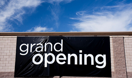
Your message is the most important facet when it comes to delivering information on your advertising banner. If it’s unclear, it’s over. If people are driving by and your banner looks like the one below, they’ll have no idea what you sell. It will entice very few to be interested in your store.
Your message needs to let people know what kind of place you own. If you’re having a 50% off sale, put it on there. That big price reduction will sound amazing to people, and is likely to attract them to come in. If your sale is only something like 10% off, then keep it off. A 10% price drop will probably not seduce someone to give you a shot. In a case like this, use words that might be able to coax people in. Utilize buzz words and phrases like “Blowout Sale” or “Huge Savings” or “Sale Ends Soon.” A call to action is important as well. Tell your audience why they should enter your place of business. Give them a reason. Let them know why they’ll benefit by choosing you instead of a competitor. But, as you’ll see in the next section of this article, keep your message simple.
Text on Your Banner:
We understand your inclination to want to put every and all amounts of information about your business on your new banner. You want to tell everyone about all the products you carry, what your prices are, what your company’s mission statement is. You have to pause and step back. There are some big reasons to live by the theory of “less is more.”
The first reason is that the attention span as a whole in the country has gotten so short in recent years. If you overwhelm people with too much information, they might fell massive amounts of text are just too much to deal with. You could lose them before you know it. Then you’ve lost a sale or a potential lifetime customer.
Also, think about where your advertising banner might live. If it’s outdoors and you’re trying to reach road traffic, understand how little time passersby will be able to view your message. There is a pretty standard industry philosophy regarding letter size and the distance in which people can read that text. These equations make it very clear that less text is actually a much more effective way to get your message across. One last point on text amount—you might want to consider going more image-heavy versus mass amounts of words. Why? Here’s why:
- 65% of the country’s population say they are visual learners
- 94% of articles with relevant images get more views on average
- 10% of information is recalled three days after hearing it. Adding a picture boosts that number to 65%
Color Schemes:
We just told you to think about going image-heavy instead of lots of text. What we want to advise is keeping the color amount on your banner to a reasonable amount. This is a fictitious sign for a fictitious restaurant:
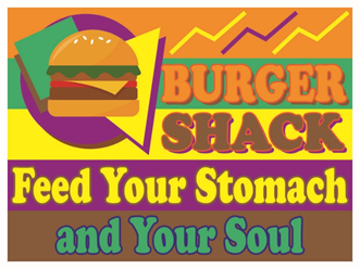
This is too busy to deal with. There are seven different colors for the eye to absorb. There is some compelling science that goes into visual comprehension. With the extreme amounts of colors in the banner above, a human’s eyes and mind literally can’t handle looking at it. This visual experience is too chaotic. The human brain will reject what it cannot organize, and what it cannot understand.
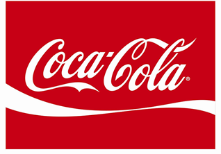
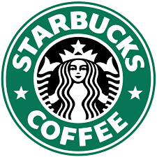
Simpler color schemes will be accepted much more readily than ones that are jumbled and overdone. We aren’t suggesting you be completely boring when designing your sign and its colors. What we are suggesting is work on a theme that matches what your business is. An example would be if you owned a baby consignment shop. Light blues and light pinks would work well. And take a cue from a couple companies that are highly recognizable around the world:
Fonts:
Fonts might not seem very critical to think about, but in fact they are. Three things to get to are:
- Amount of fonts in your banner
- Using recognizable fonts
- Symbolic fonts that represent your business
Amount of Fonts-
If you mix in too many fonts, your message can quickly become confusing to the eye. When you’re designing your banner, keep saying to yourself, “Using more fonts isn’t better. Using more fonts isn’t better. Using more fonts isn’t better.” Say it as often as you have to so it becomes crystal clear for your banner printing vision. There is no real hard and fast rule to a number, but the general practice is to limit your design to one or two max. That’s not to say you can’t run with a higher number, but you need to have a good reason to do it. This article should be easy for you to look at…we’re only using a single font. How irritating would it have been if we did this:
Recognizable Fonts-
There will be exceptions to this thought, but ordinarily, it’s a good idea to use fonts that are recognizable. This will help potential customers to become familiar and “comfortable” with your business. Among the easy-to-read fonts are Arial, Helvetica, and Times New Roman. They’re all good, distinguishing fonts you should consider using. They are fonts people are used to seeing on their cell phones, in emails, and in texts. So, there is a familiarity that instantly connects your signage and viewers’ minds.
Symbolic Fonts-
That exception we just mentioned lives here. If you own an elegant or fancy type of business, using cursive fonts or ones that are symbolic of your products and/or pricing will tell customers you are high-end. It lets them know you’re a step up from your competitors.

In Closing:
How could an advertising technique that costs less than $35 have so many moving parts to it? It’s still advertising, and you want to get it right. The better your banner is on all the aspects discussed in this article, the more new clientele you’ll get, and the more money you’ll earn. And after all, those are your goals.
When you call us to order your new banner, we’ll help you begin to achieve those goals. We’ve been in the banner printing industry for a decade, so we’re extremely knowledgeable about the industry. If you have questions, we’ll answer them. If you need advice, we’ll give it to you. We’ll go through the steps with you, as a team.